Feel the Way: Redesigning Emergency Evacuation Maps for Equal Access by the Visually Impaired
Published:
How to create equal escape opportunities for blind people in emergency situation?
Context
Evacuation directional maps are essential for people to find their way out of a building in emergency situations. Therefore, Taiwan’s Public Place Safety Regulations require them to be installed in public places. Blind people are more vulnerable than sighted people in such situations; however, most directional maps are designed only for sighted people.
- Conducted at: OurCityLove, a social enterprise in Taiwan
- Supervisor: Cong-Wei Lin
- Project Type: Professional project
- Impact: Results shared with visually impaired groups and contributed to Taiwan’s National Fire Agency’s guidelines for tactile map design.
Target Problem
For blind user, there have tactile maps, which use textures to help blind users read. However, there are 2 challenges:
- Design relies on textures and Braille, which is unintuitive for sighted users
- Limited installation: They typically installed only in locations frequented by the visually impaired, such as special schools.
The project aims to design generalized tactile evacuation maps that are intuitive, accessible, and suitable for public use.
Method
1 Solution Design
- Generalized Tactile Maps:
- Integrated tactile elements (textures, shapes, and lines) with traditional visual map designs.
- Introduced map elements categorized into six groups: texture, line, arrow, icon, shape, and corner.
- Prototype Development:
- Used a 3D printer to create map prototypes.
- Tested prototypes with visually impaired participants for usability and accuracy.
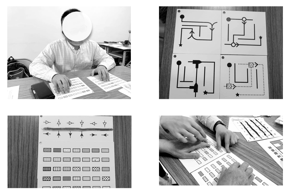
2 Experimentation
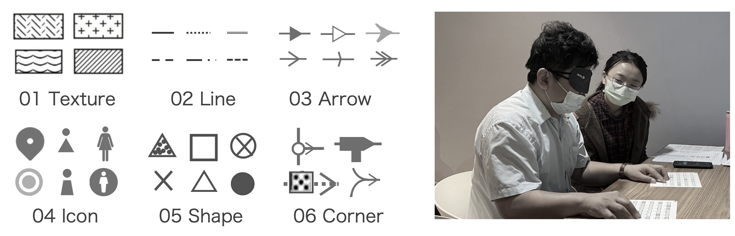
- Texture Testing:
- Guide the participant to touch the target texture on recognize broad
- Ask the participant to find the target texture on the search board
- Record accuracy and time taken

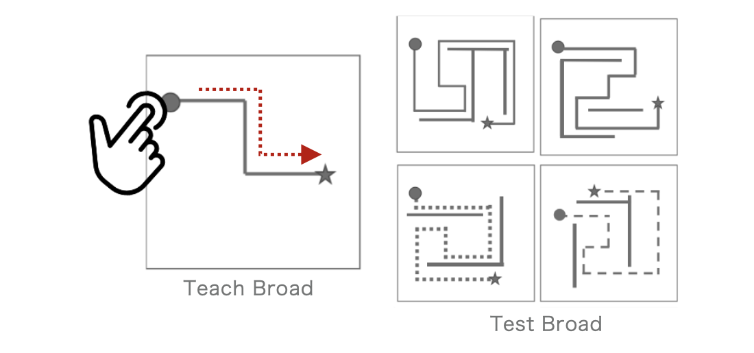
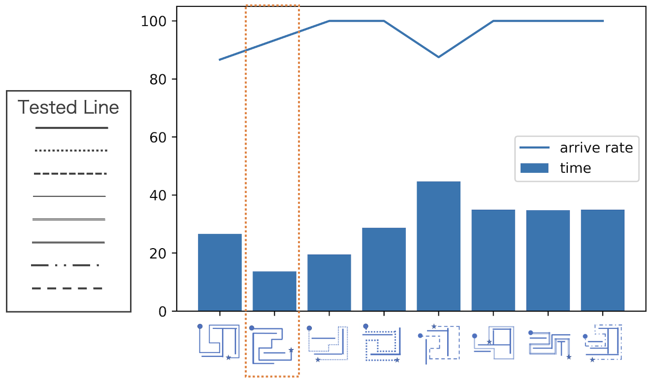
- Line Testing:
- Guide participants to trace a line on the teach board from start to endpoint.
- Asking participant to trace lines on testing broad
- Record time and accuracy
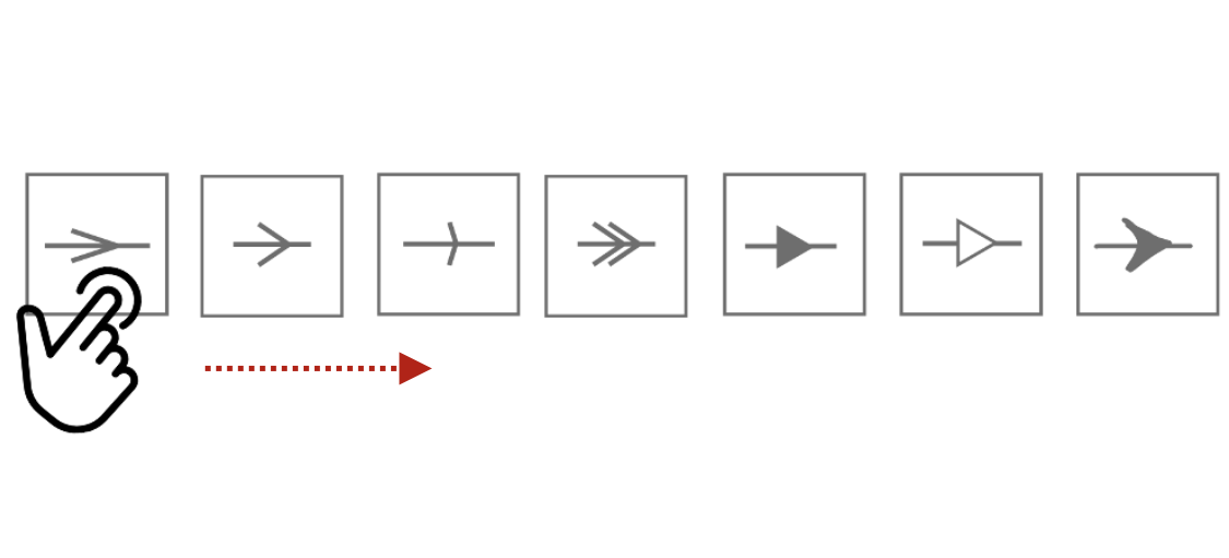
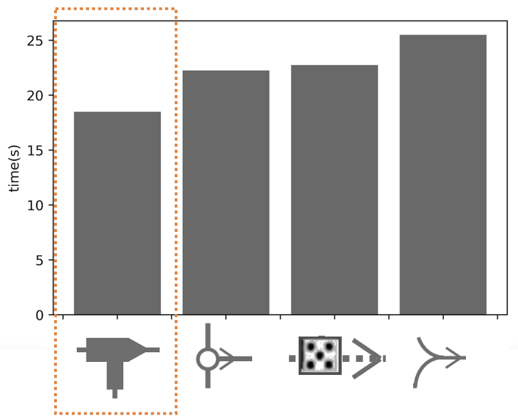
- Arrow Testing:
- Ask participants to touch the arrows on the test board and state their direction.
- Record accuracy and time taken.
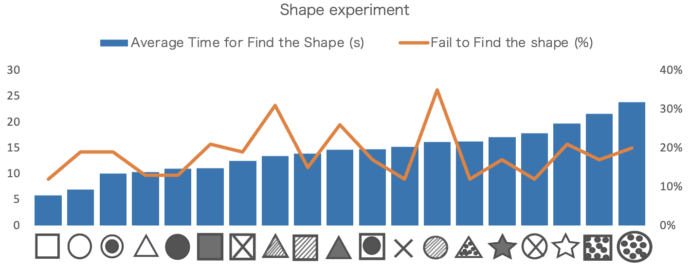
- Shape Testing:
- Ask participants to touch the arrows on the test board and state their direction.
- Record accuracy and time taken.

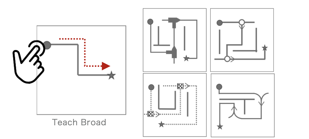
- Corner Testing:
- Guide participants to follow a line with turns to the endpoint at the test broad.
- Asking participants to trace lines on testing broad
- Record time and accuracy at turns.
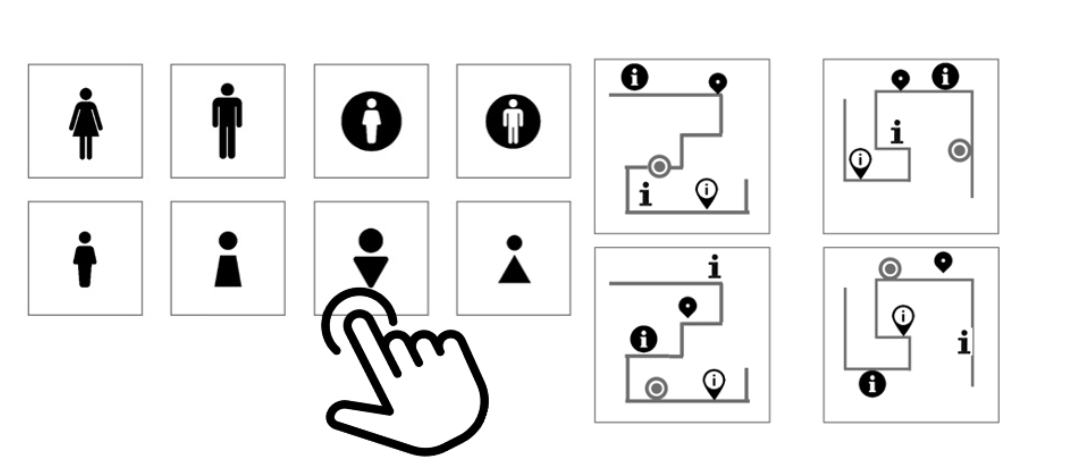
- Icon Testing:
- Ask participants to touch icons and state that they think it represent a female/male restroom
- Asking participants looking for the sign represent a service centre /current location on the map
Results
Texture
- Qualitative interview:
“The textures within shape is confusing. Should I focus is on feeling the shape, the texture, or something else?”
- Observation: Star for participants are “something with sharp angles”. It often confused with triangles.
Line
- Qualitative interview
“The simpler the lines, the better. Tactile resolution cannot distinguish subtle difference between dashed lines.”
- Quantitative evidence
- The solid line required least time for tracing line and have 90% arrival rate.
Shape
- Qualitative interview:
“The textures within shape is confusing. Should I focus is on feeling the shape, the texture, or something else?”
- Observation:
- Stars are “something with sharp angles” for participants. It often confused with triangles.
Icon
- Participants showed no clear preference for specific icons.
For congenitally blind participants, the concept of “images” does not exist in their life experience, so icons are entirely non-intuitive for them.
- Highest recognition rate for female bathroom icons: 52.6%
- Qualitative Interview: Multiple participants mentioned that it is identified because the tactile sensation resembles a circle, evoking the association with a feminine and gentle image.
- Highest recognition rate for male bathroom icons: 70.0%
- Qualitative Interview: Multiple participants mentioned that it is identified because the tactile sensation resembles a square, evoking the association with a masculine and robust image.
![]()
Arrow
- Qualitative interview Result:
- Line arrows is better, but arrows with angles greater than 45 degrees, which resemble a cross, are more likely to misidentification.
- Quantitative Evidence:
- 100% of participants can correctly recognize the line arrow with angles less than 45 degrees required least time for recognize outperforms the solid triangular arrow by 35% in accuracy and is 3.5 seconds faster in recognition time.
![]()
Corner
- Solid Corner sign required least time for participants to trace the line to end point.
- However, the difference is not significant for participants in our interview.
Impact
- Established practical guidelines for tactile map design:
- Guideline 1 Avoid using icons on maps, as they are not intuitive for blind users. Replace them with shapes or textures when necessary.
- Guideline 2 For Arrow: line arrows with angles less than 45 degrees are preferable.
- Guideline 3 Avoid using different dot lines represent different meaning. The dotted line and the solid line are recommended.
- Guideline 4 Avoid radial shapes with sharp angles, such as star shapes. Rounded, square, or simple triangular shapes are recommended.
- The shapes should not contain textures within them, as this could create confusion about whether the focus is on the shape, the texture, or something else.
- Incorporate line arrows with clear directional cues.
- Guideline 5 The internal patterns of the textures should be as simple as possible. Avoid textures that are too dense or intricate. Preferably, use textures composed of lines.
- Influenced Taiwan’s National Fire Agency to adopt standardized tactile map guidelines.
Implementation
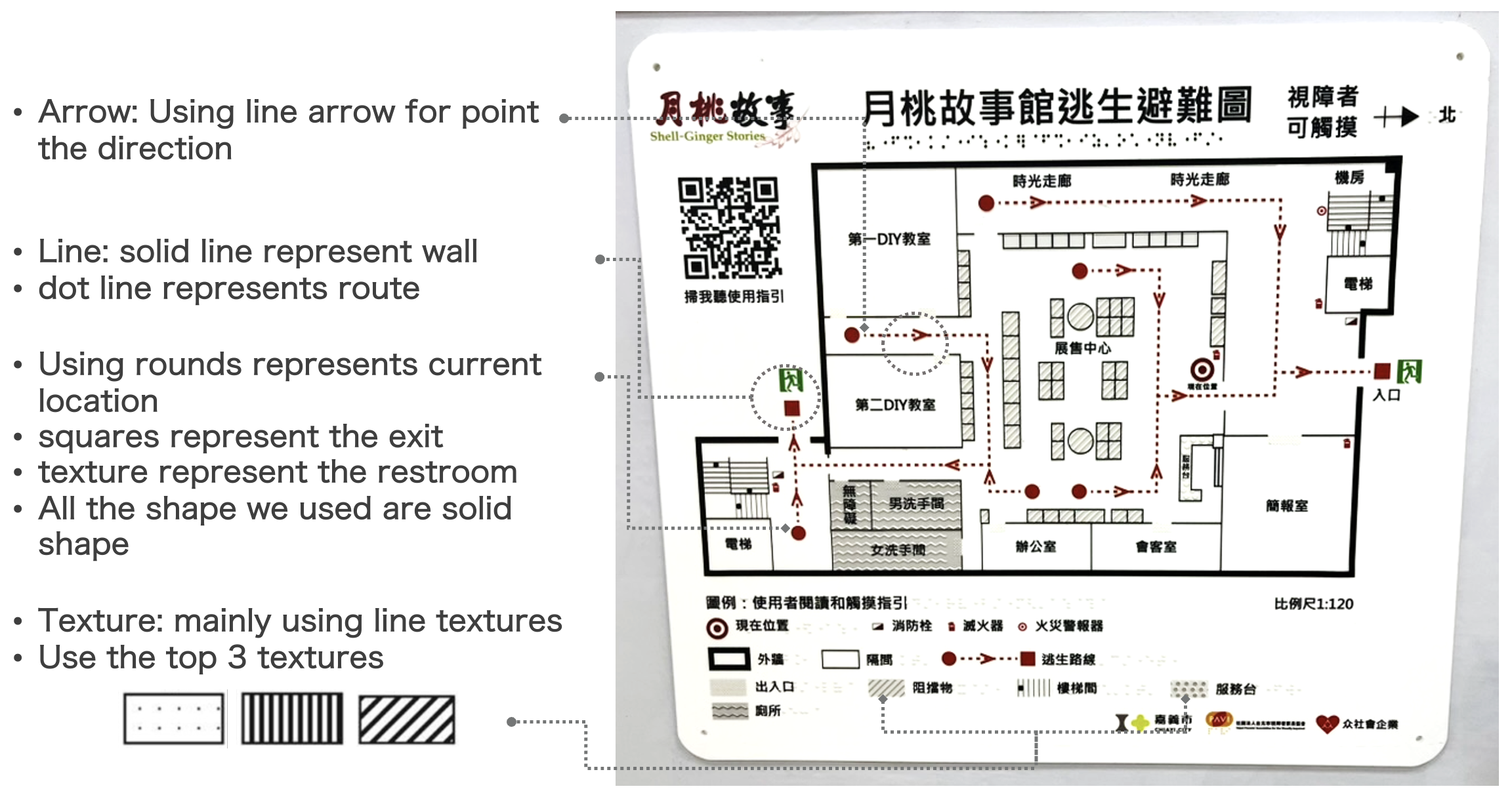
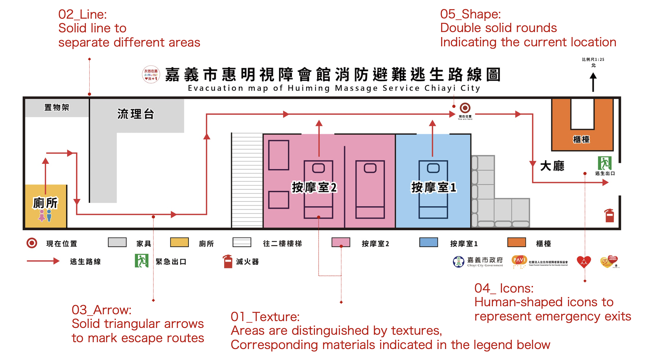
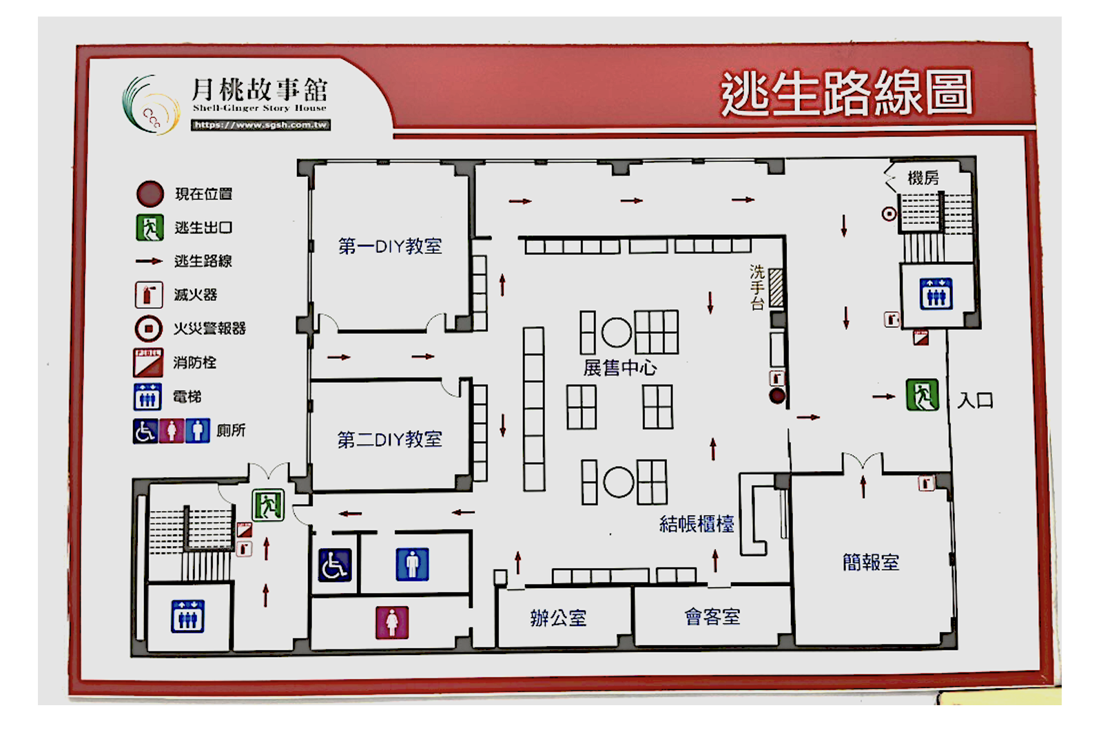
Cooperating with the visually impaired group, we installed first generalize map in Moon Peach Story House, a tourist spot in Taiwan with over 400,000 annual visitors.
Map before redesign
Map After redesign